So, after last week’s post, did you watch the premiere of HGTV’s Design Star Season 6 with me? I let Little Moore stay up late so we could watch it together.
I think that Vern’s “I think I’ve seen enough” is the Design Star equivalent of Tim Gunn’s “Make it Work” or Tyra’s ultra-long-winded “You’re still in the running to becoming America’s Next Top Model”! Seriously… it could be the next college drinking game! Every time Vern says, “I think I’ve seen enough,” it is time to take another shot! Just kidding. Kind of.
The first episode of any running-contest-style-show is always a little sad. Someone has to leave… and they only had one 60 minute show to showcase their talent. And by showcase their talent, I mean present to the world their worst work ever. And then, they’re gone. No chance to redeem themselves.
This Premire was especially tough, because it was a team challenge. Personally, I hate being forced into a team with someone I don’t know. And from the performance of some of the contestants last week, I can tell I’m not the only one. I usually get stuck with the overbearing person… or I am the overbearing person. Or both – which isn’t pretty, but would make for some awesome dramatic moments on TV!
The judges were right in line with my thinking on this episode. I agree that orange rooms, unfinished woodwork, and tea light holders screwed to the wall with exposed wood screws are all bad ways to make a first impression. So is a wallpaper focal point with poorly applied wallpaper.
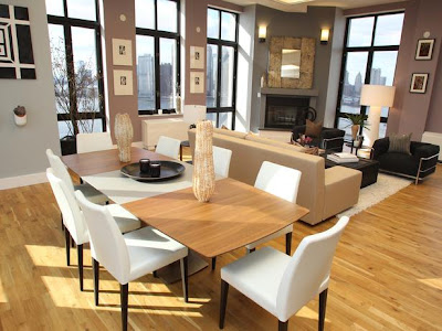
Yes, there was some cringe-worthy design, but the room that got second place – stunning! I’d love to have a great room like this in my house! Of course, I’d love to have those stunning views, too! It is simple and elegant… even though the designers didn’t exactly see eye-to-eye.
I’d probably have the same expression on my face that spunkly little Leslie did after a cell phone call from uber-professional-on-camera-because-she’s-a-five-time-Emmy-award-winner-Cathy saying Leslie should trust her. Ahem. Trust takes a little more than 24 hours to earn.
I can’t say if the trust was earned or not here… but respect for having serious design chops absolutely was.
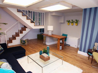
The winning room was an awkward space made awesome through the use of cool painting techniques and fun design in the bonus room. I love that Karl and Kellie won, despite spilling half a can of paint all over the floor. This shows that keeping your cool in the face of potential disaster pays off big time.
Poor Kellie was frantically cleaning up paint, and when time was called, she was covered in it. Though she looked like a hot mess, the design that she and Karl came up with was just plain HOT! and earned them the top finish, with Karl taking first place for his awesome paint job.
I did check out the preview of tonight’s episode, which will be on HGTV at 9pm/8c, and am confident that it is going to be as suspense-filled as last week’s! The designers will be facing the infamous White Box Challenge. They each get the exact same white space, and their challenge is to make it fabulous. Usually, there is a twist – last season’s white box challenge had designers creating spaces for each other… and required the designers to do all of their shopping at an Asian Market. I wonder what tonight’s twist will be?
With the opportunity to host their own show on the line, I hope that some of the contestants like Not-so-RELAXed-Brett, Horrible Headboard J, and Sans Styling Meg and Tyler step up their game!
I know that I haven’t seen enough yet…
Always,
Disclosure: This post is part of a sponsored campaign by Crafterminds and HGTV Design Star. My opinions are my own.


Leave A Reply!